A before-and-after shot: from strange concrete “appendage” to “red carpet”.
A few notes from the “Awkward Spaces Makeshop” with the Stanford d.school, where interdisciplinary teams each performed a quick makeover prototype on an “awkward space” of their choosing on campus. With only a few hours and limited materials, speed and creativity were valued over perfection.

We started off by exploring a small part of the campus and identifying “awkward” spots – be they awkward because of social interaction, design, spatial relationships, or use over time.

This table, for example, was bolted onto the concrete on the upper deck of the student union. Not only is the table – and its chairs – fixed and immovable (limiting social interaction), its also placed by itself (away from the other seating), in a corner (that catches all the sun), unshaded, and wedged in between two plate glass windows that look into office areas (awkward privacy issues). What’s more, the door behind the furthest chair can’t open all the way without hitting the seat (remember – its bolted in place). I can’t imagine anyone loving this awkward seating arrangement.

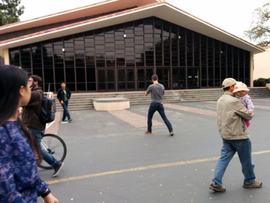
Next, the group shared back their awkward spaces and chose teams to work on a particular spot for the rest of the day. We chose this concrete “appendage” awkwardly and unattractively protruding from a stairway directly in front of the main entrance to a music hall. With no clear function – or even aesthetic decoration – this flat topped “podium” seemed ripe for an intervention.

This shot contextualizes the “appendage”, showing how its also centered in a pretty generic, colorless, hardscaped setting. Pedestrians and cyclists pass right by it (foreground) on a busy path, without being invited into the space for any conceivable reason.

With only four hours to come up with an idea, build it, and install it, our team quickly started throwing out ideas about how we could make the space less awkward. We discussed how different interventions could “highlight” the awkwardness (by making it stand out even more or even leveraging it), or “hiding” the awkwardness (by reconfiguring a space or how its used). We opted to highlight the appendage, and to actually use it as a centerpiece or stage. With the Oscars scheduled to air that evening, and the appendage’s location in front of a performance space, we came up with the idea of creating a faux “red carpet” VIP area on the concrete platform, complete with photo backdrop for the Stanford community to shoot selfies.

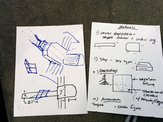
Without a measuring tape, we made some quick guesses (using sneaker measurements) about the dimensions, then headed back to the d.school workshop to start building our prototype.

Part of our team got to work on building a frame for the backdrop.

Part of our team started creating on-brand Stanford imagery for the backdrop, adding additional colors to brighten up the drab concrete space.

A canvas dropcloth formed the backdrop, and construction paper and masking tape stood in for stencilled logos.

With time running out until the end of the workshop (and the day!), the team setup the backdrop using zipties.

Blue butcher paper stood in for a red carpet, and a pallet made a step.

Since the space was awkward, we called our intervention the “Awkward Oscars”, complete with an awkward fake Oscar make from tinfoil to hold up .

The photo backdrop in use.

Selfie station complete with hand held sign, and awkward, tilted tree.

Much more colorful and fun than before!

Fellow team members creating a wayfinding sign that corrected an unused and unloved “awkward understairs” space, and simultaneously worked to help confused new students find a student ID office (confusingly and awkwardly located on a second floor midcentury building with only two outdoors staircases to locate).

A third team worked to “un-awkward” an unloved and underused seating area outside the student union hall, with a few strange seating arrangements (including a table with no chairs), dirt for ground cover, and a pile of trash behind both sides.

The team created a “sculpture garden” by creating a prototype modern art sculpture on a table, and added a simple screen as a backdrop to make the space feel more intimate and block trash from view.
Thanks Our City, d.school, and the teaching fellows!
